


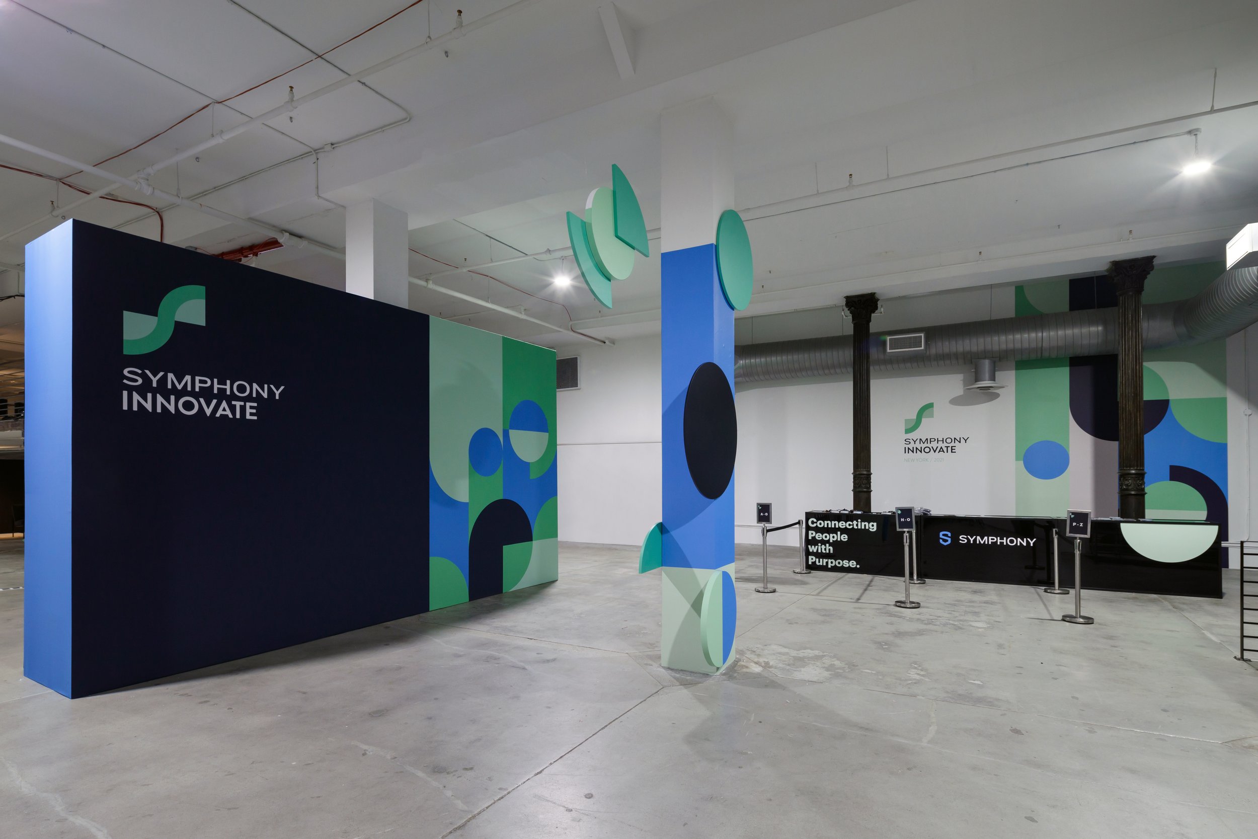

Symphony is a secure & compliant collaboration platform for the global financial markets. The project scope was to rebrand Symphony Innovate: the manifestation of the Symphony network through recurrent in-person and digital events. Symphony Innovate is focused on the community building process among the organisations and customers that constitute the Symphony universe.
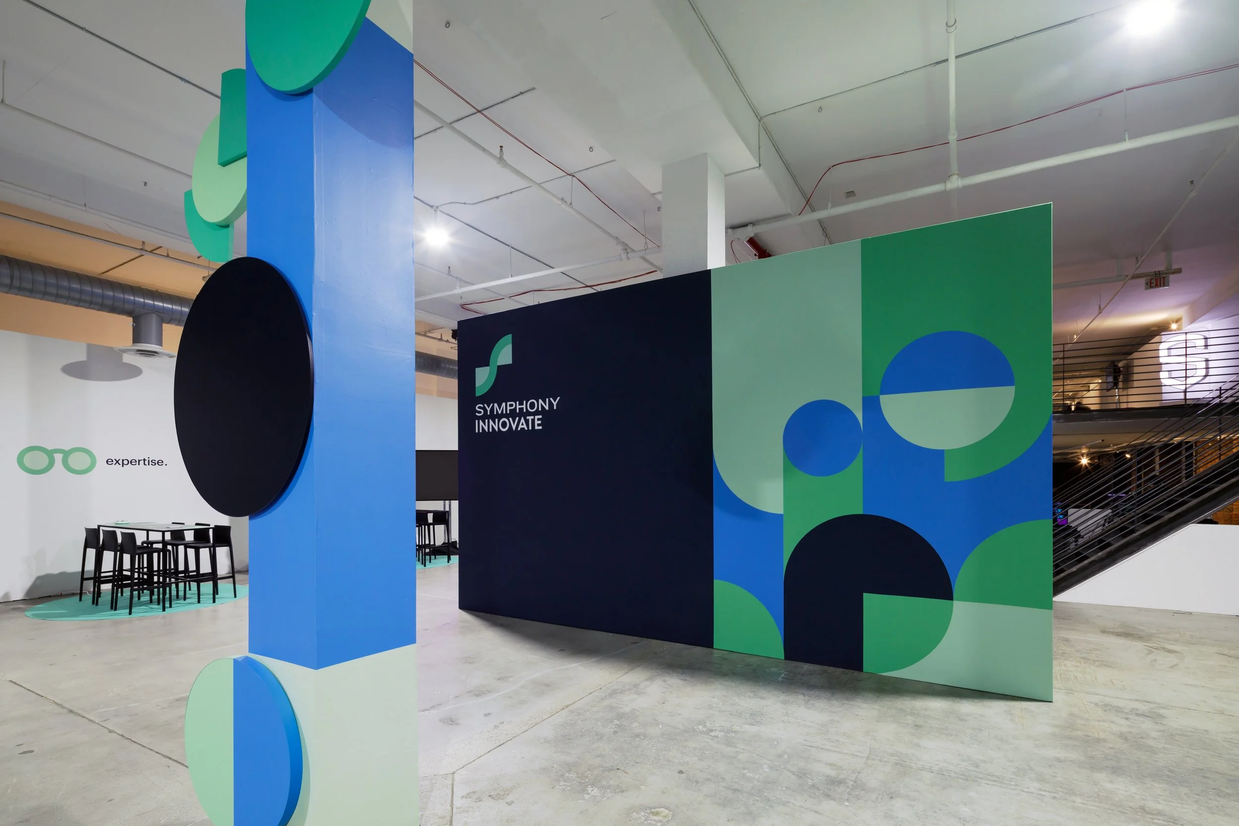
The inspiration of the new brand identity is the Innovation S-Curve. It is a distinct and critical diagram in tech & finance, as it plots the typical life cycle of a technology through four major stages: development, growth, maturation and decline. The new branding communicates and reflects the following values: cutting edge, innovation, growth, progress, openness, movement, communication, renewal, and it makes sense & appeals to analytical minds from the fintech and banking sectors, while having a fresh style. It is a flexible visual system, able to roll-out across screen and print, from digital campaigns and presentations to worksheets and stage design and signage, as well as have limitless permutations to adapt and sub-brand all future events.
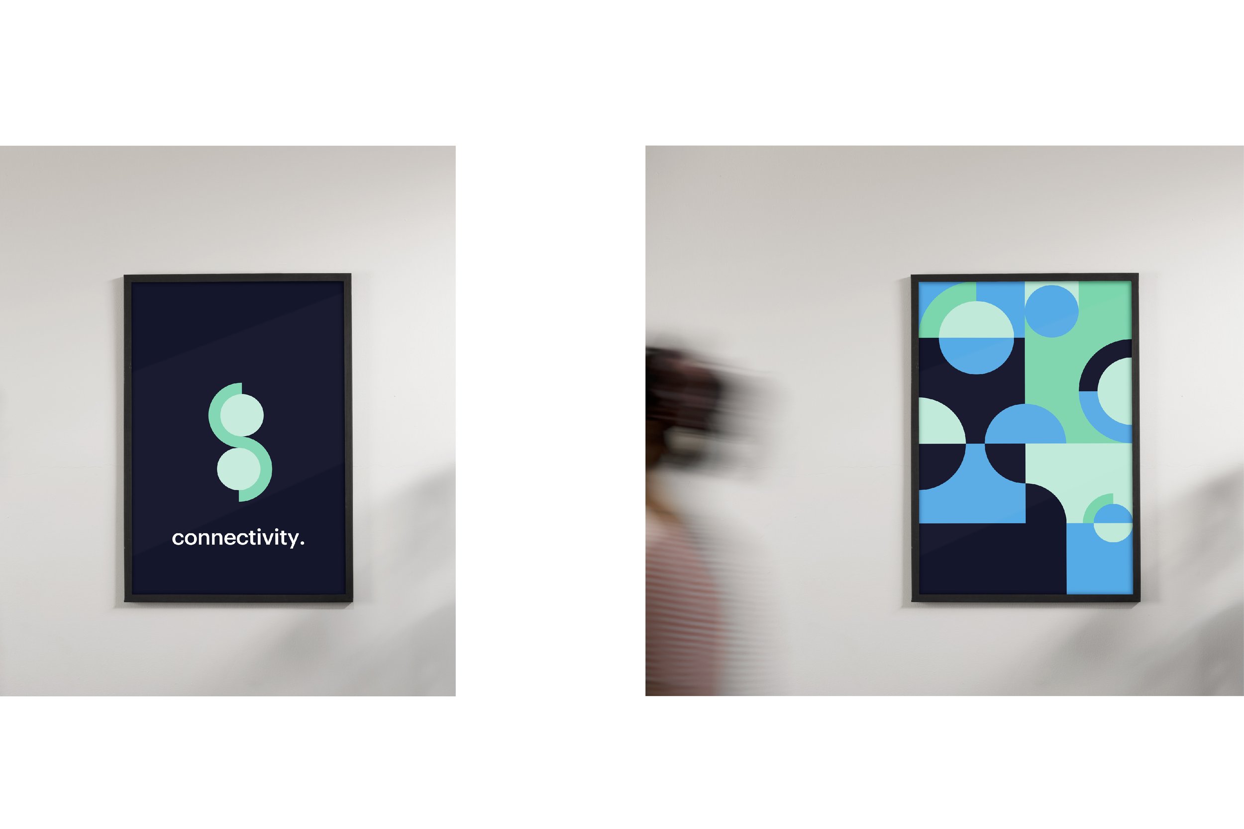
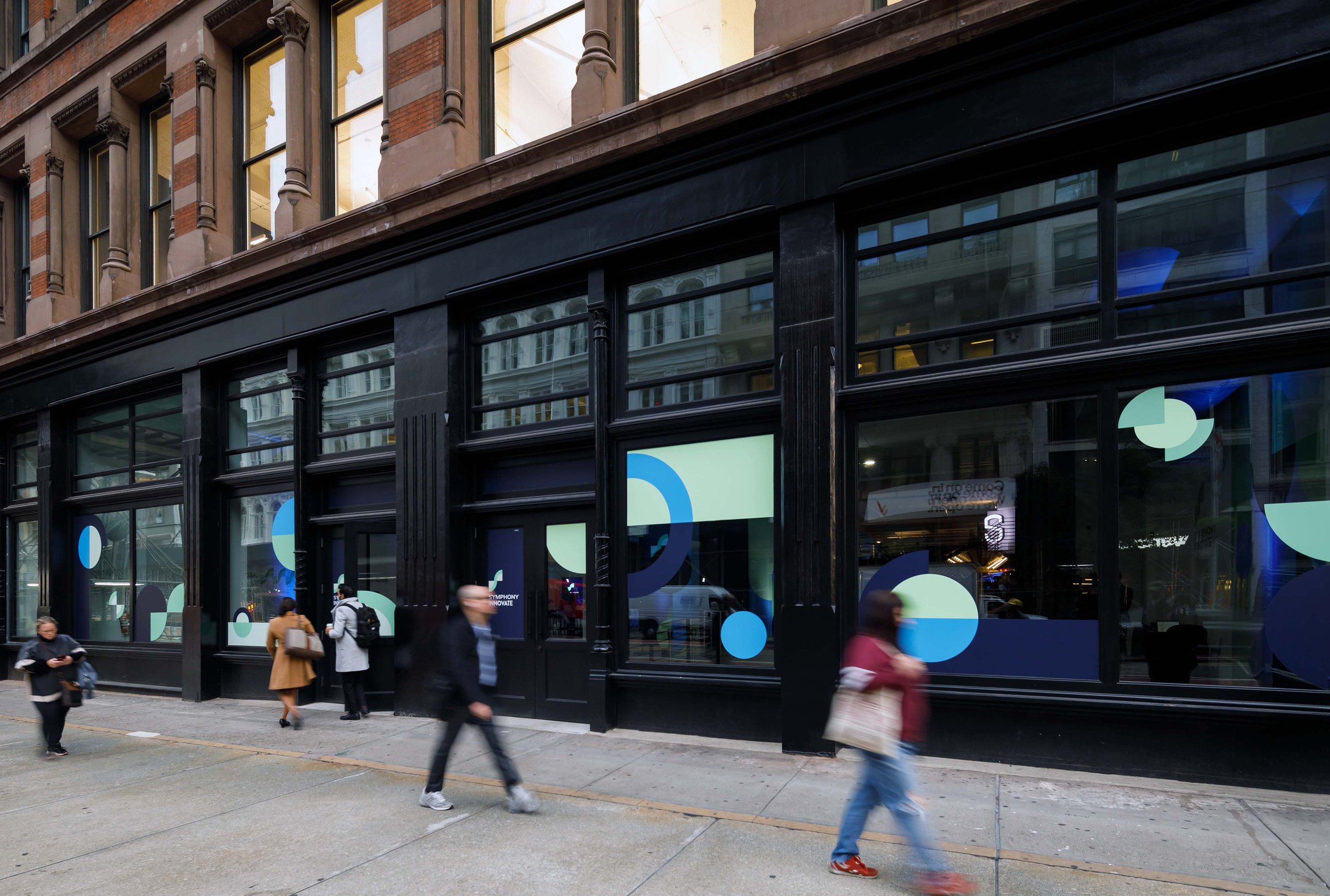
The new brand identity of Symphony Innovate is a dynamic visual system whose basic design elements (circles, semicircles, quarters) can be adapted to visually communicate individual event themes and formulate different messages, as well as create a distinct logotype stemming from the Innovation S-Curve.
The dynamic visual language of the brand, communicates clearly and effectively the brand’s culture, values, and vision and sets the “beat” of the community. It can be adapted semantically and formally, with more or less complexity, to address the specific needs of the emotional tonality needed and it can seamlessly roll out on print and screen.
The brand identity encompasses a wide variety of resources and is recognisable and distinct with the use of a colour scheme that is vibrant and fresh, yet builds on emotions such as innovation, growth, community, proximity and trust. The primary colour palette is a harmonious composition of greens with high vibrance, saturation and contrast, adding to the traditional colours of the financial world a more engaging and contemporary feel.
Client: Symphony Communication Services LLC, USA
Creative & Art Director: Christina Biliouri
Event & Space Design: Mark Stephen Experiential Agency
Project Manager: Francesca Stabile
Web Development: Adrian Maseda
Images of Iron23 building: Collin Miller